Which colour should I choose?


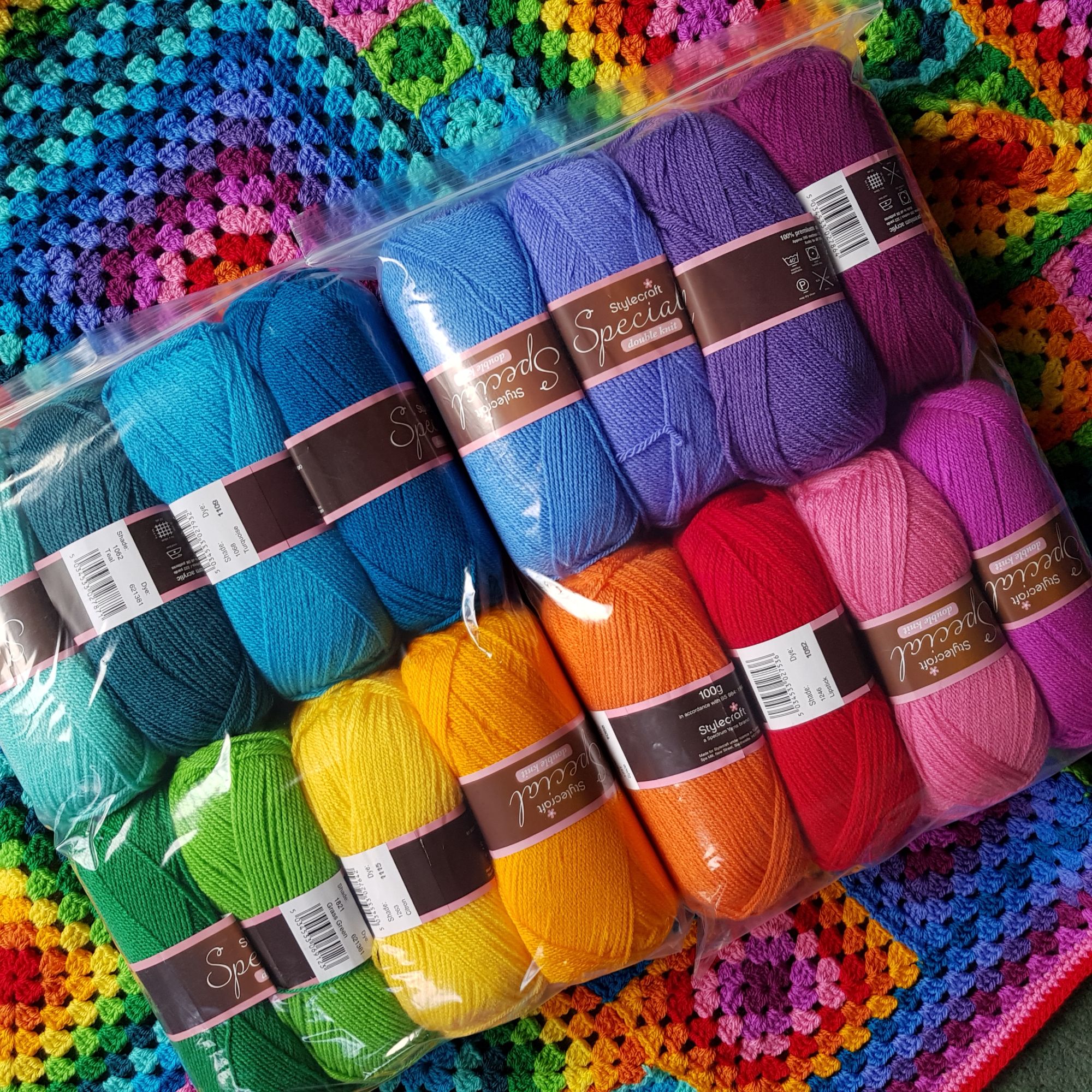
It’s a question that I asked a lot when I had my shop, and it is something that I love to do so I am going to let you know a bit of colour theory and show some of the colour packs that I chose to sell and make blankets for – and if after living with them for a while I would change any!
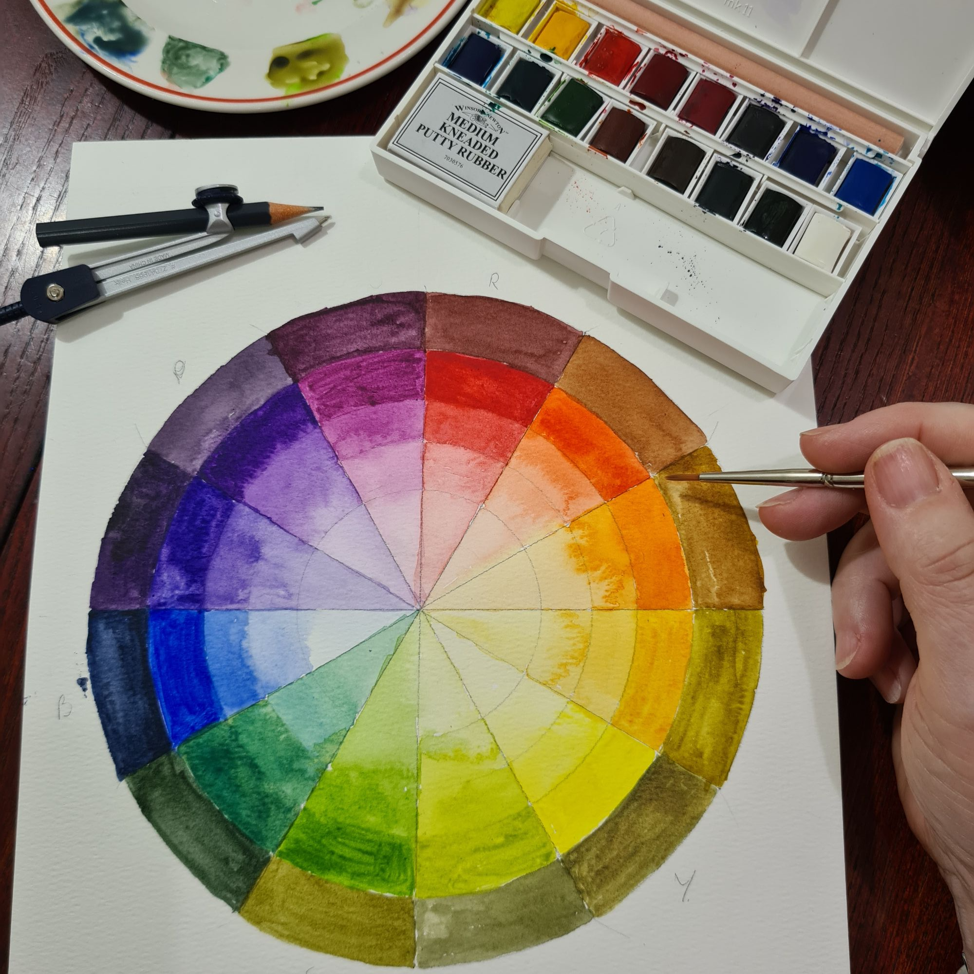
One of the first things you learn to do in an art class and bear with me for a minute! Is to create a colour wheel using just 3 colours (and black and white for shades and tones) – and it is very important which 3 colours you have – Red, Yellow, Blue – BUT they must be true primaries – that is they must not have anything of the others in them. Yellow can sometimes look orangey – that means that it will not make a good green, more khaki colour. Red can veer towards blue or yellow, towards blue and you will get a great purple colour but not orange!
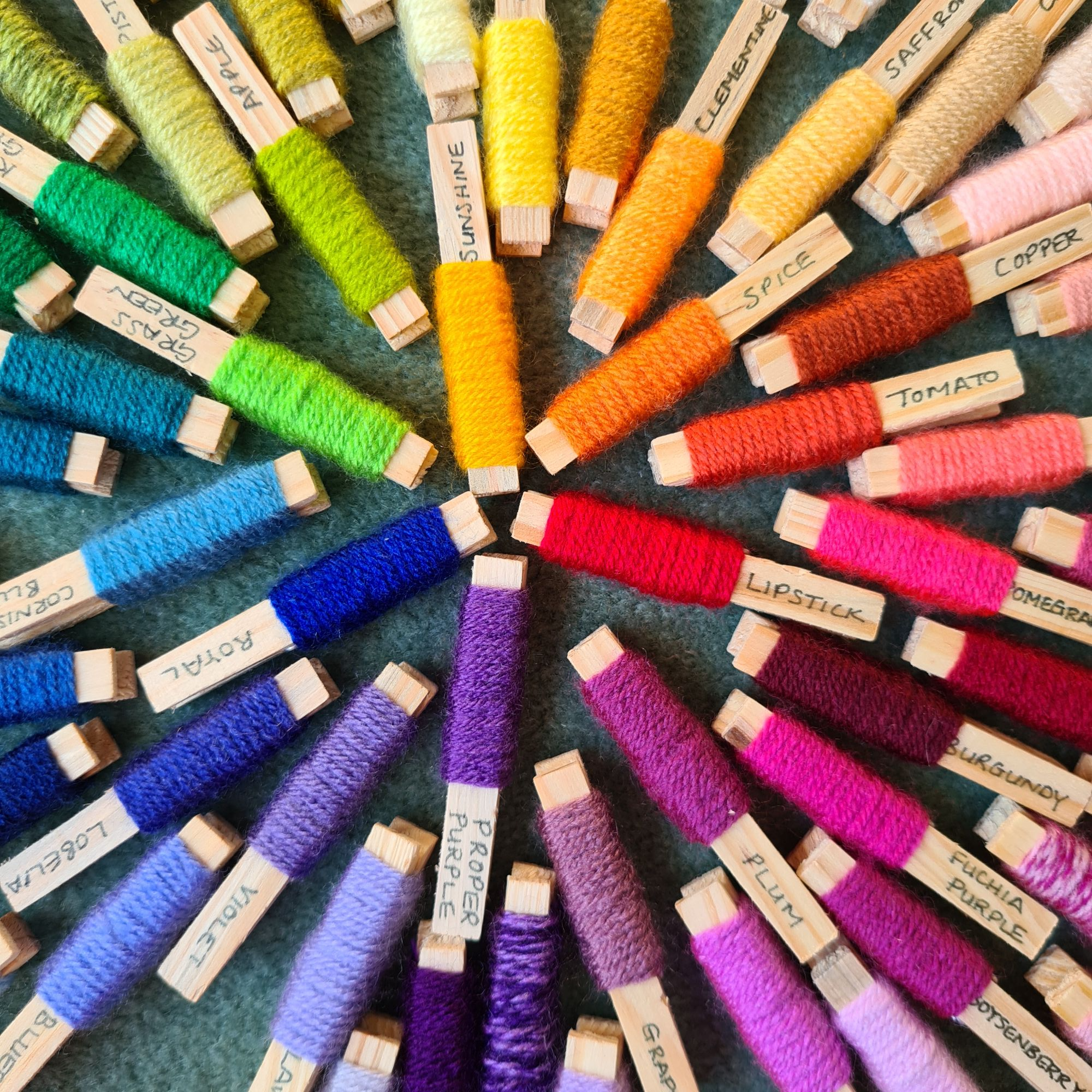
This photo shows a close up of the centre of the colour wheel in yarn. These pegs are all Stylecraft Special DK, and there are 100 colours! And before you ask – I did not make them, I bought them from CraftycraftsBySheila on Etsy. And they are fabulous!
These are my go to for choosing colours to start with – I would then go to my local wool shop - Crates of Wool, and put the colours out in a larger scale, to see if they do go together.
You will see that the closest to neutral primary colours are Lipstick, Sunshine and Royal, Secondary colours are spice, Grass green and Proper Purple.
And between each of them – clementine (yellowy orange) tomato (orangy red) Plum (reddy purple) Violet (purply blue) Teal (greeny blue) and Apple (yellowy green)
You might say to me that is all well and good, but how does this help when choosing colours.


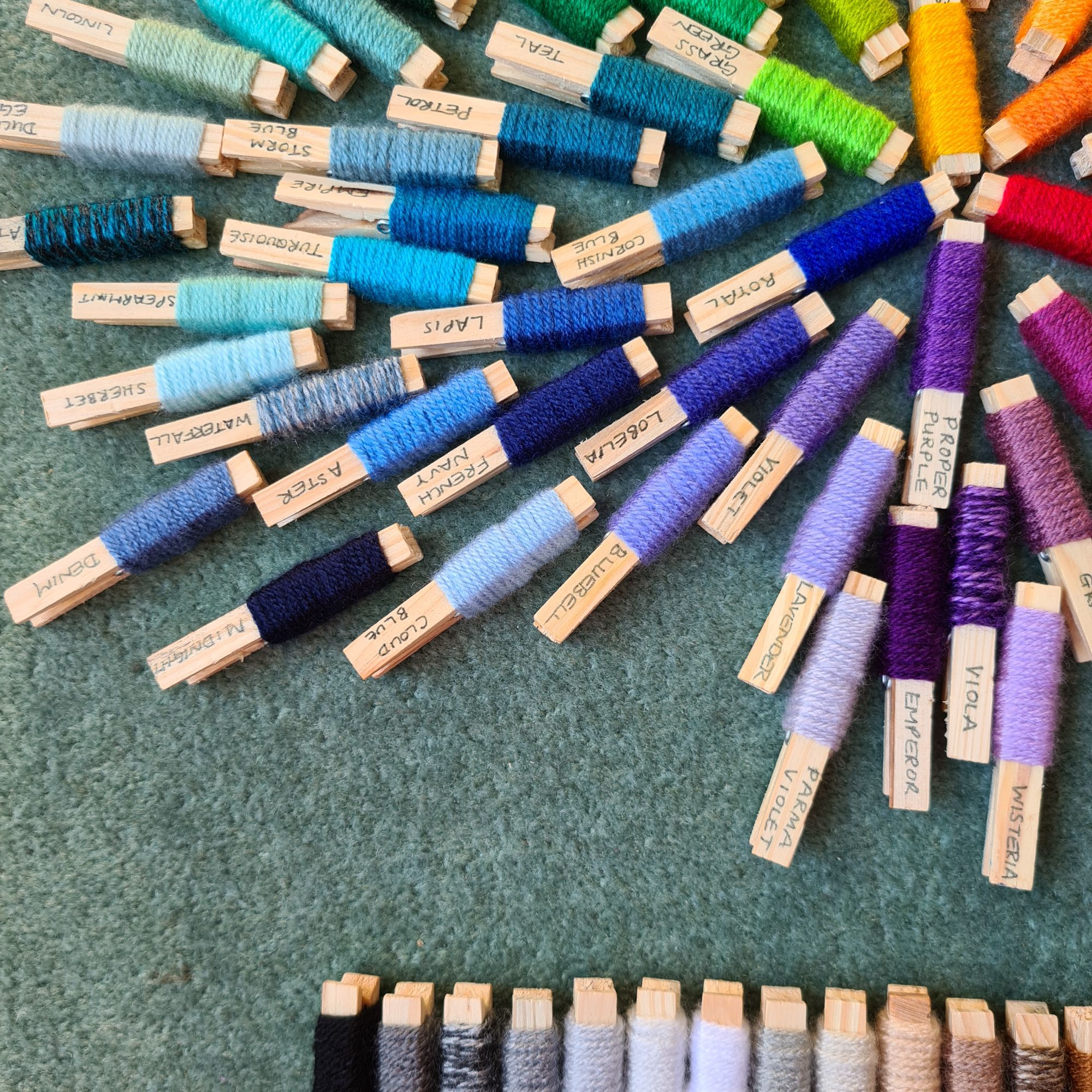
So lets start with what might be your favourite colour – blue, you can see from this section of the colour wheel, that there are many blues to choose from, from greeny blues like teal to purply blues like Bluebell, all of these will go together and you might like to add a neutral, like silver. What I would then suggest is looking at the complimentary colour – these are Red and Green, Blue and Orange, or Yellow and Purple – you might notice that these are one primary and the secondary colour made with the other two primary colours!
So if we are blue heavy we might want to add something from the other side of the colour wheel, like spice, or more subtle camel or apricot. (insert picture made up of these colours)
Another way to choose colours is to have them in the same tone, so pastels, or brights, and this comes back to my colour choices!
