
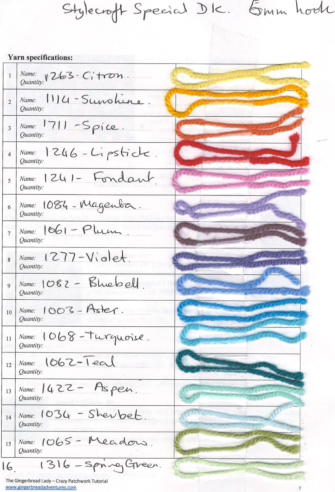
6 colour choices...
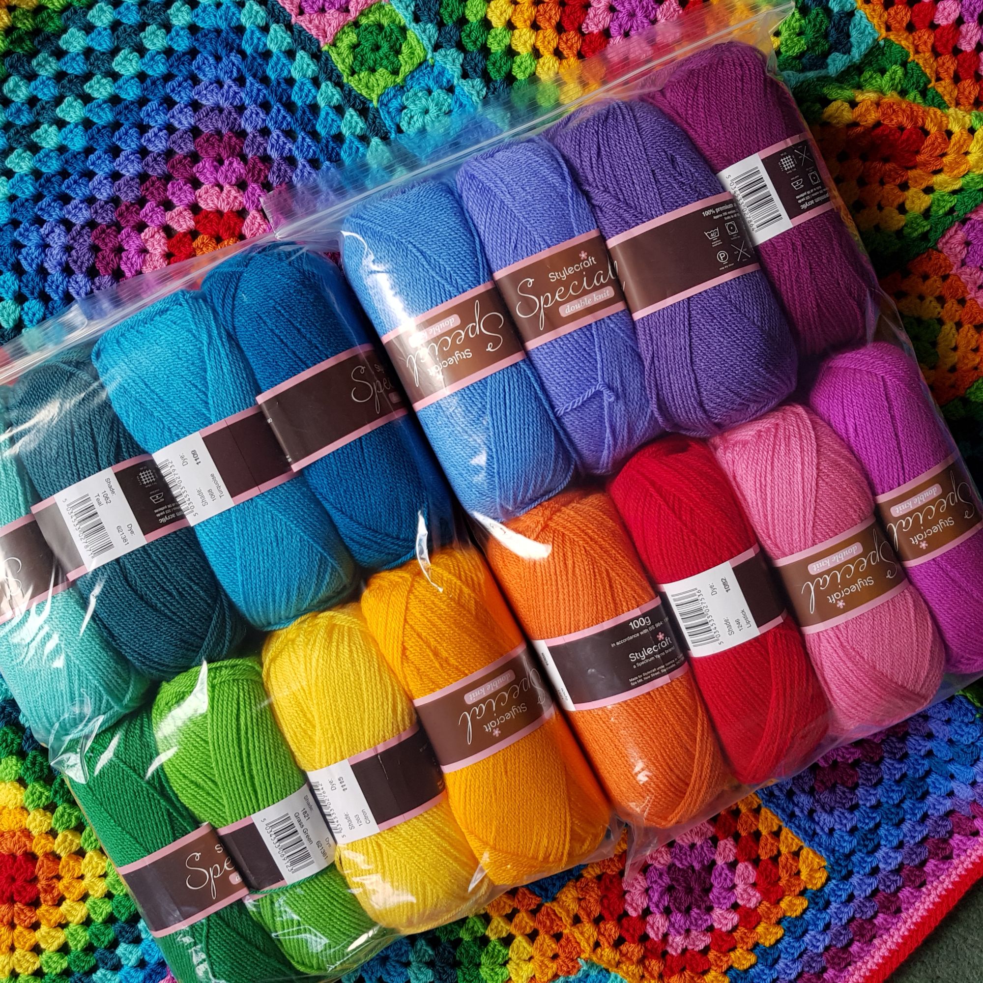
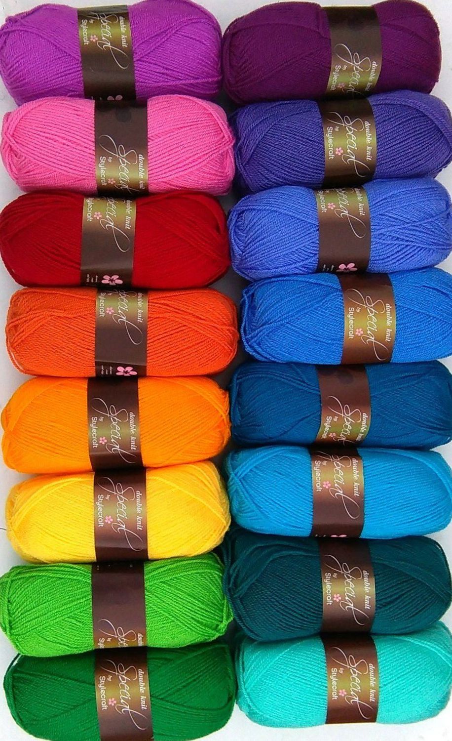
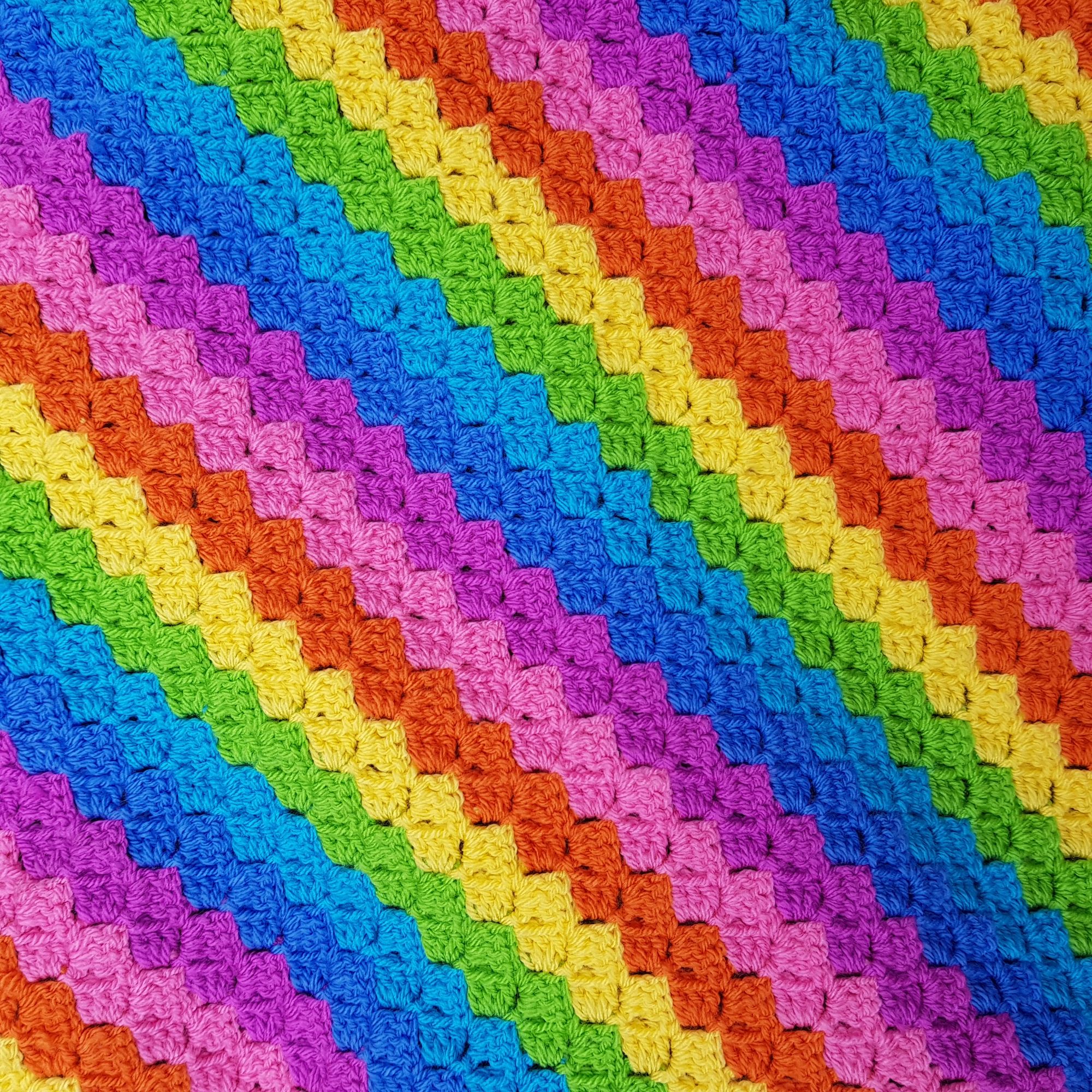
I love a spectrum of colour – a rainbow if you like - taking colours from all around the colour wheel. My rainbow blanket is a classic example with 16 colours – and at one point I did change them.
These were my original 16, but when Stylecraft bought out Grass green and Kelly Green I had to replace them in the pack – and as that put some of blues out I changed a couple there too.
So starting bottom left we have the two greens, then a yellow, an orangy yellow, red, then out of the colour wheel strictly speaking we have the pink, and magenta – technically a reddy purple! Then top row starting from the right, we have definite reddy purple, Purple, purply blue, light and dark close to true blue, then the greeny blues, most of these have a lighter and darker version of a similar colour.
The above images show the yarn packs - Candy – has a reduced palette, but I chose what I would call bright pastels, so although there is not a red, there is pink instead, the reds were too dark for this pack. The two blues here are Aster and Turquoise, and in real life they look quite different!
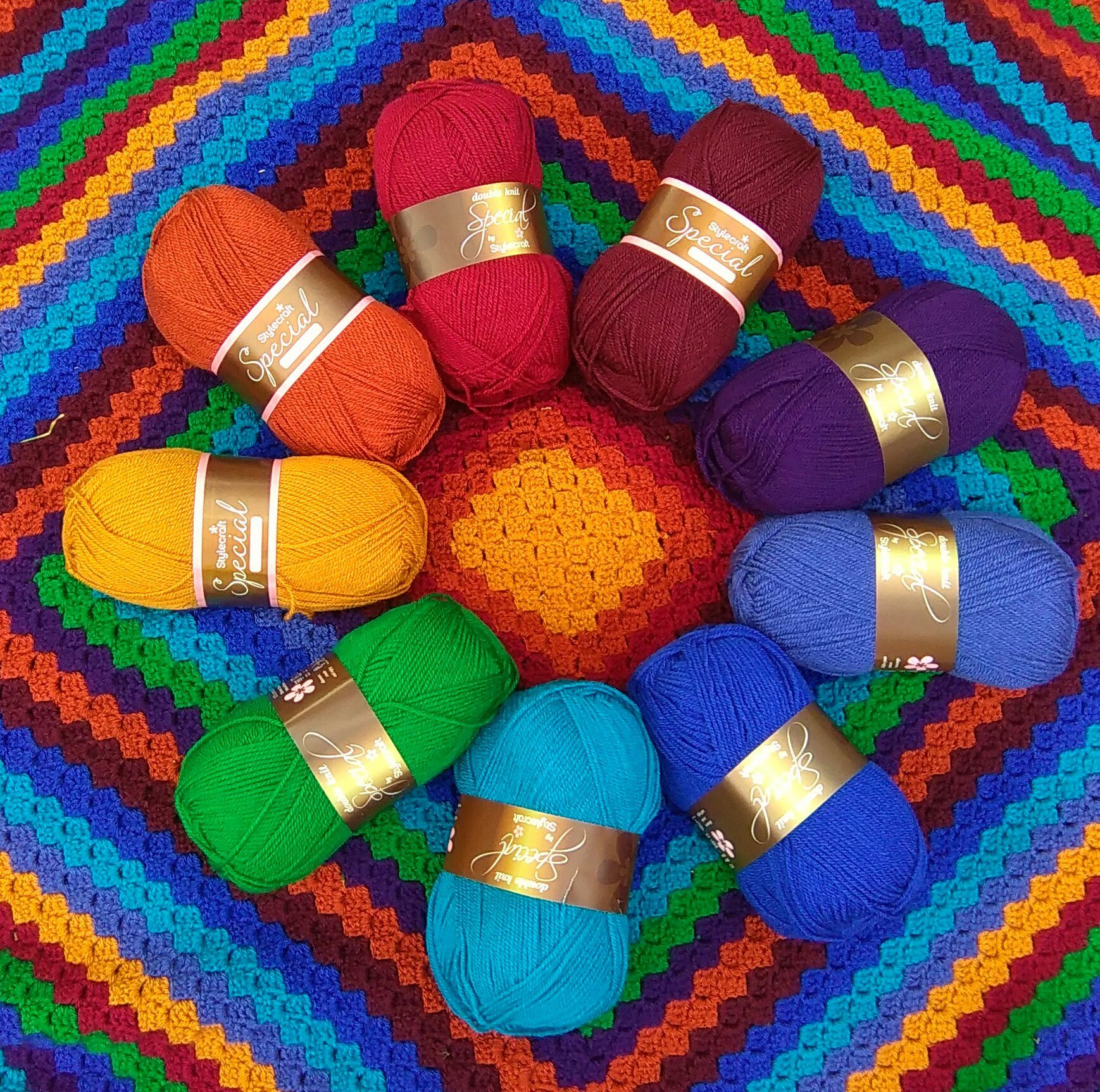
Jewel – as the name suggests has more vibrant shades, here you can see that we have half warm and half cooler colours with Gold as the unifying colour, in the centre, as the border and with just one place in the main blanket.
With the vintage palette I did choose more of my favourite colours missing out the yellows – this has a much calmer feel, but you do have a gradation of colours from blue to green on one side and purple to pink on the other with one neutral being silver and the other parma violet – almost grey but with a hint of the purple colour.
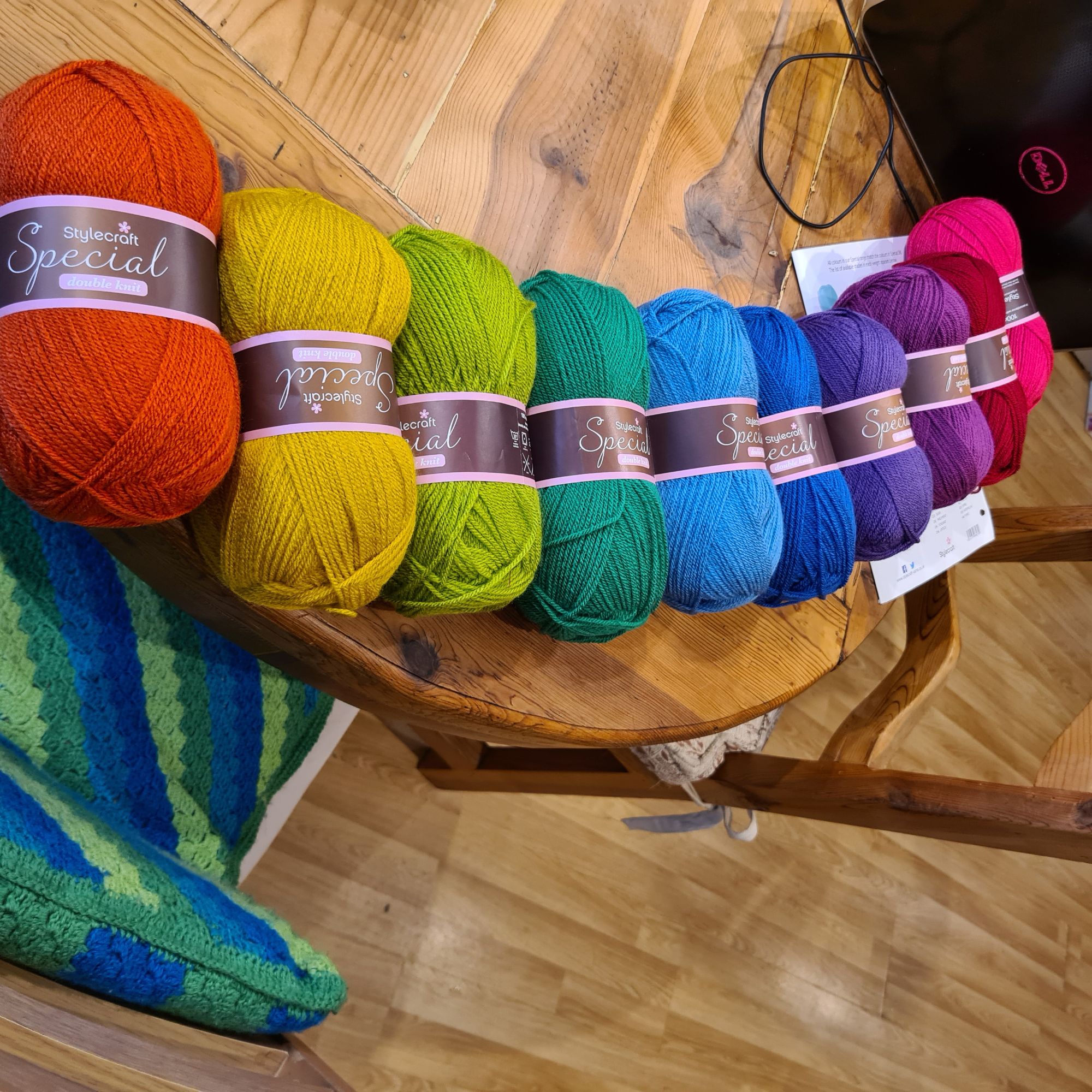
Coming on to my more recent packs – we have the masterclass colours, Sunshine and flowers, here you can see them laid out on a table in the yarn shop! I went for a more intense rainbow – quite a few of these were not available when I designed the rainbow blanket! We go from orange, yellow green, greeny blue, blue, to bluey purple and purple to pink.
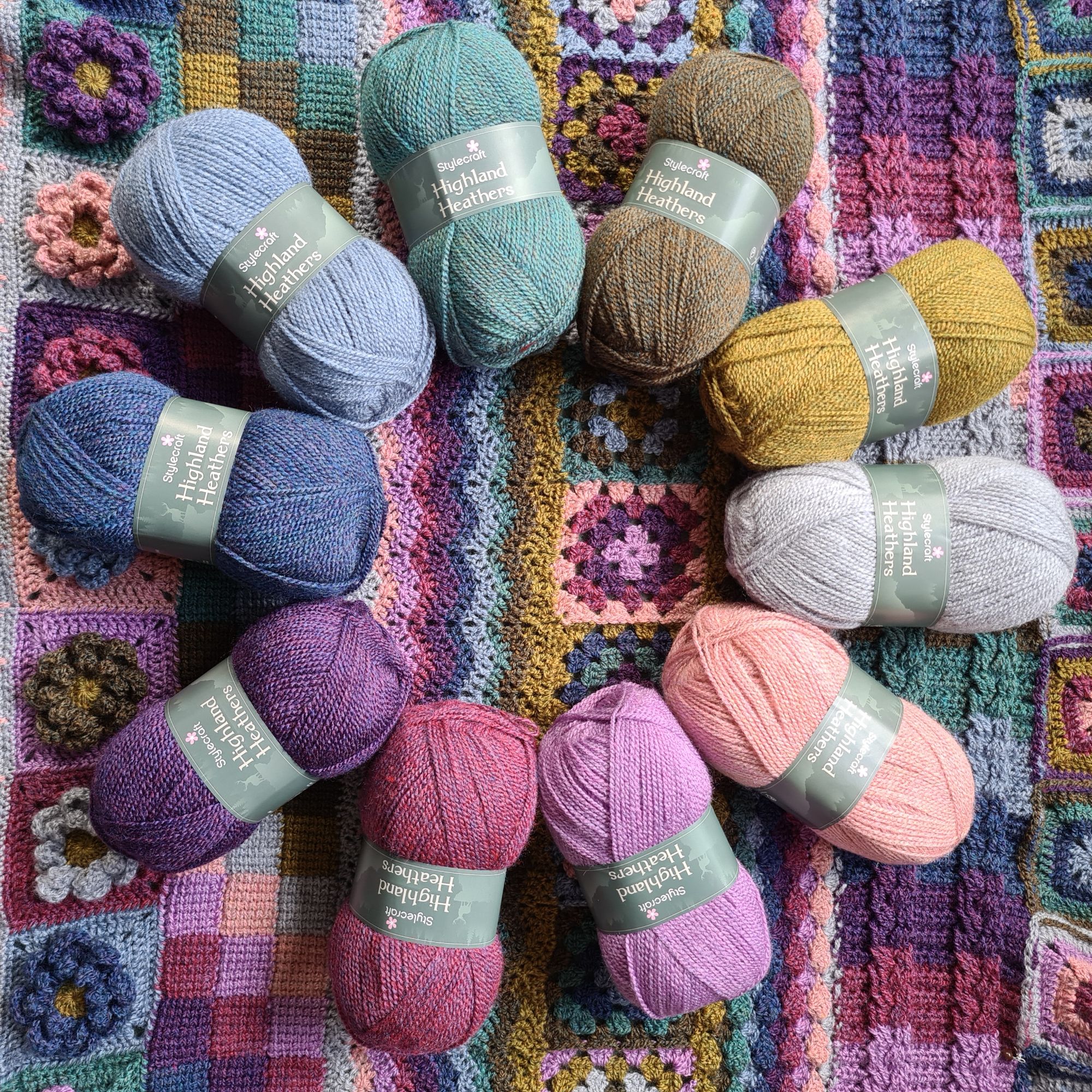
And finally with the Heathland colours, I had a different choice to make. When I designed this I wanted 10 colours, and at the time there were only 12 in the range, so it was more about the two that I was going to leave out. I left out Grist which is a beige and granite which was more brown. You might guess that I am not a huge fan of neutral colours!!
So how do you feel about choosing colours – is it easy for you, or do you need a bit of help. Have there been combinations that you love, or that you hate?